Rakuten Rewards
Digital Design
As an in-house designer, I supported b2b, b2c and internal communications efforts. Two major projects were a rebrand of the former company Ebates to Rakuten Rewards, as well as the launch of a new shopping app.
One of my responsibilities was the upkeep of web assets for desktop, mobile web and app. I maintained these assets by setting perimeters and ensuring templates were up to date for other team members to use.
Homepage Takeovers
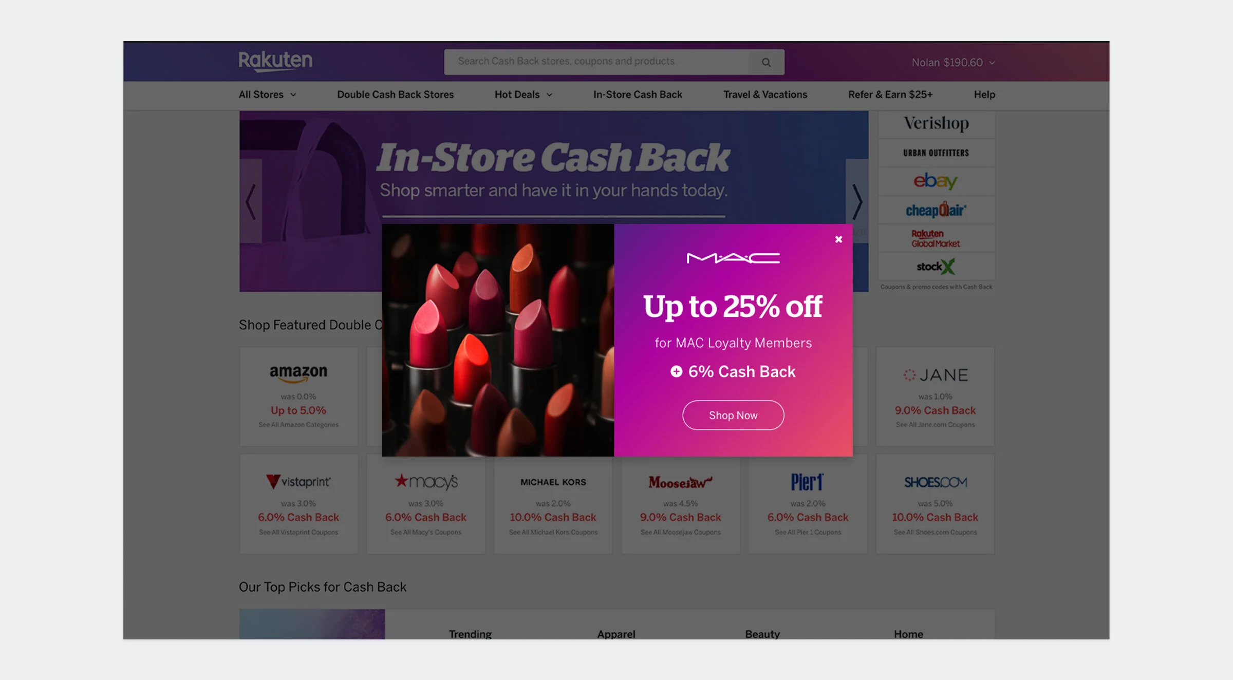
This placement would appear upon opening the homepage. The merchant’s sales and discounts were tailored to the user based on their shopping data.
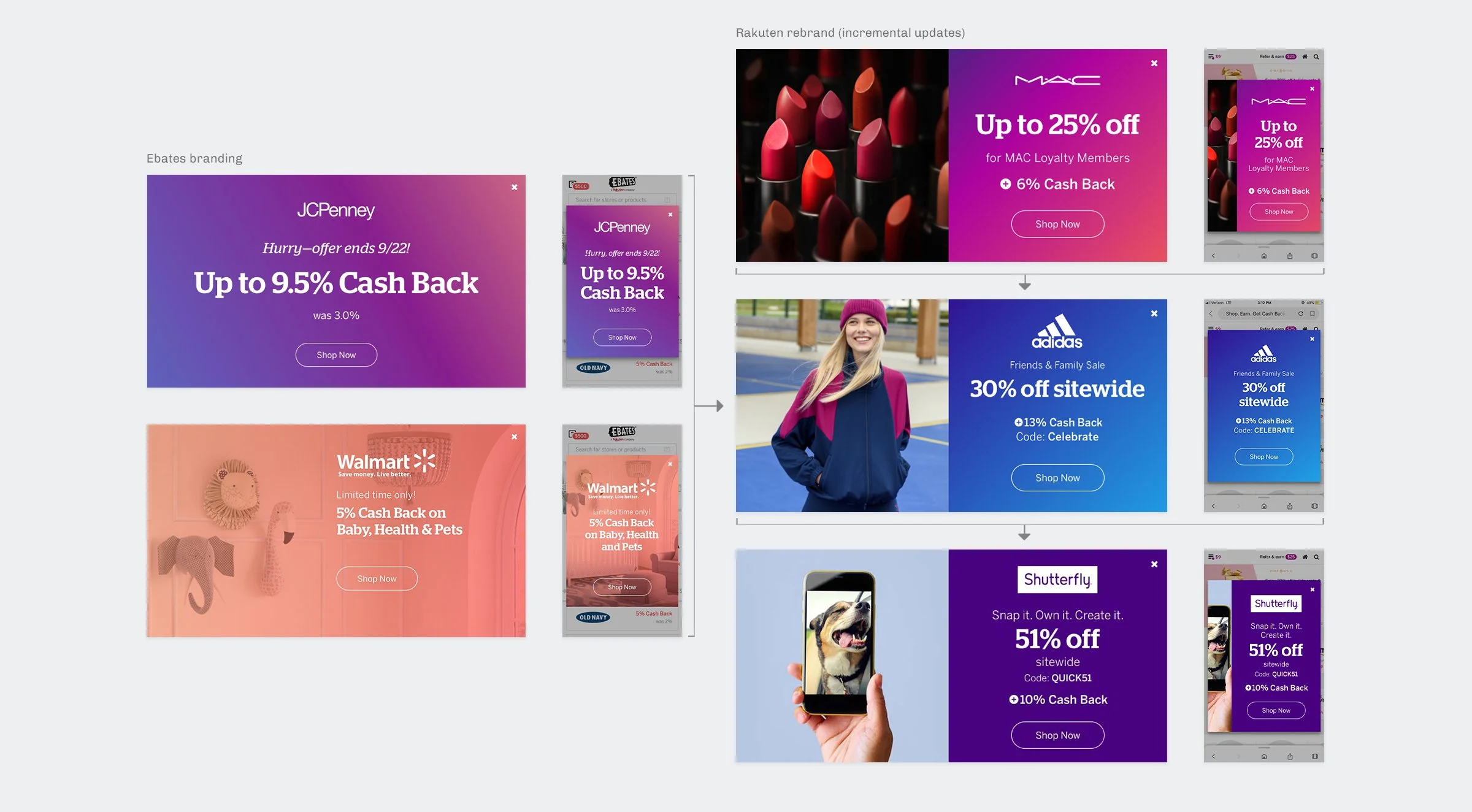
For a rebrand from Ebates to Rakuten, I standardized the placements to one design. Incremental updates were released over time to ease users’ familiarity with the new brand. Shown are the Ebates banners and rebranded iterations for Rakuten. Templates were designed for desktop, mobile web and app.
Carousel Banners
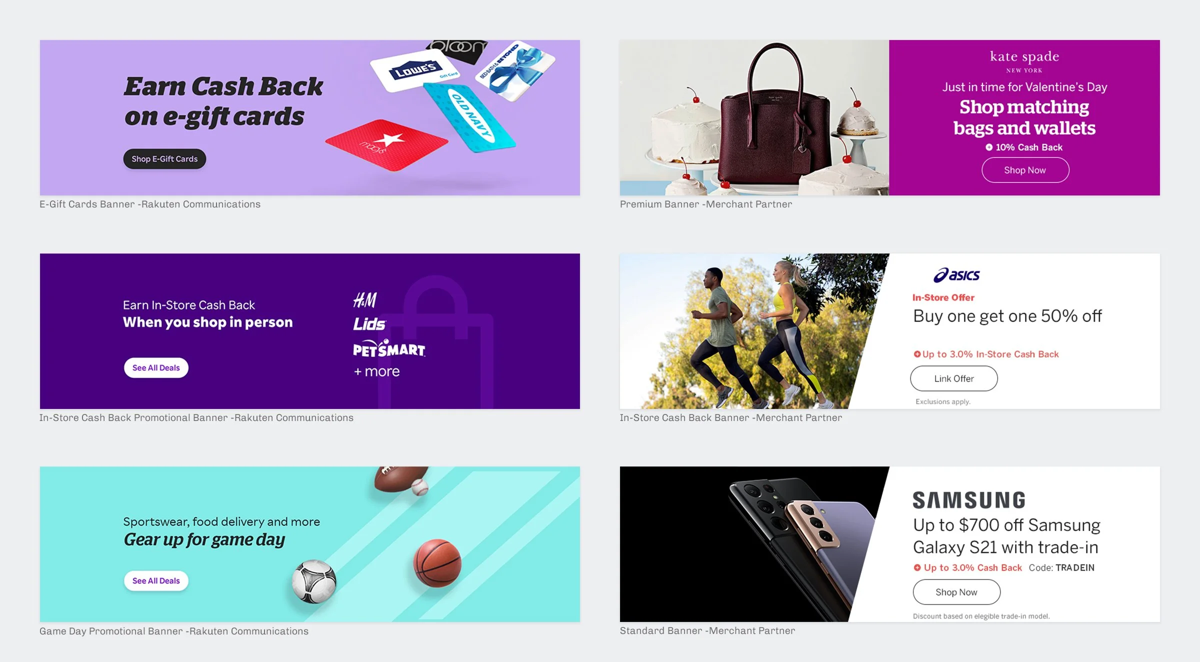
This homepage carousel housed different merchant sales and Cash Back offers. It also included Rakuten-specific messaging such as credit card ads and gift card offers. The first banner in the rotation gave merchants an opportunity for premier ad placement.
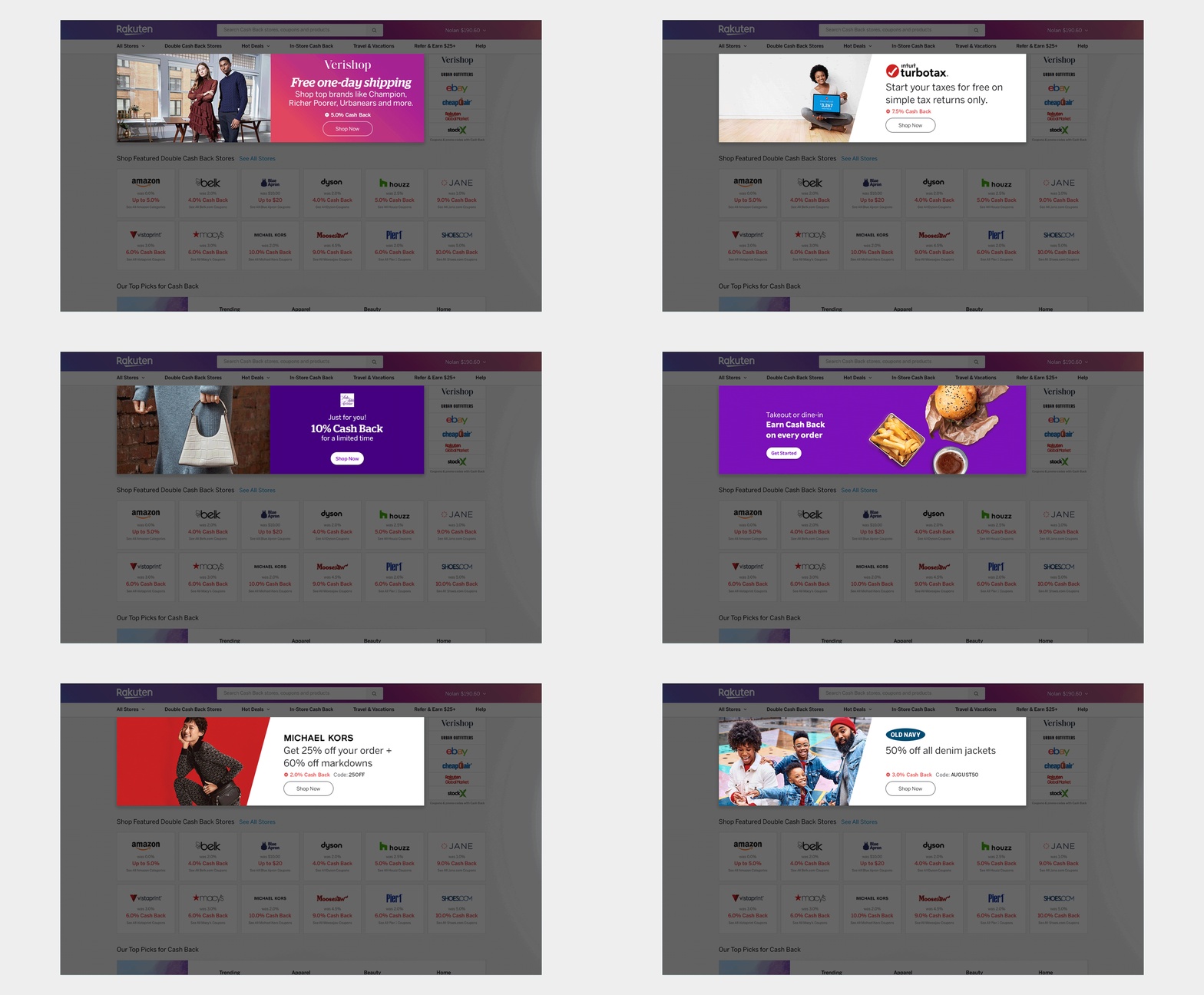
Below are examples of banners used in the carousel. These banners were designed to be responsive for mobile web. In addition, secondary versions were made for the app. The premium banners shown were revised incrementally as the Rakuten brand was updated.
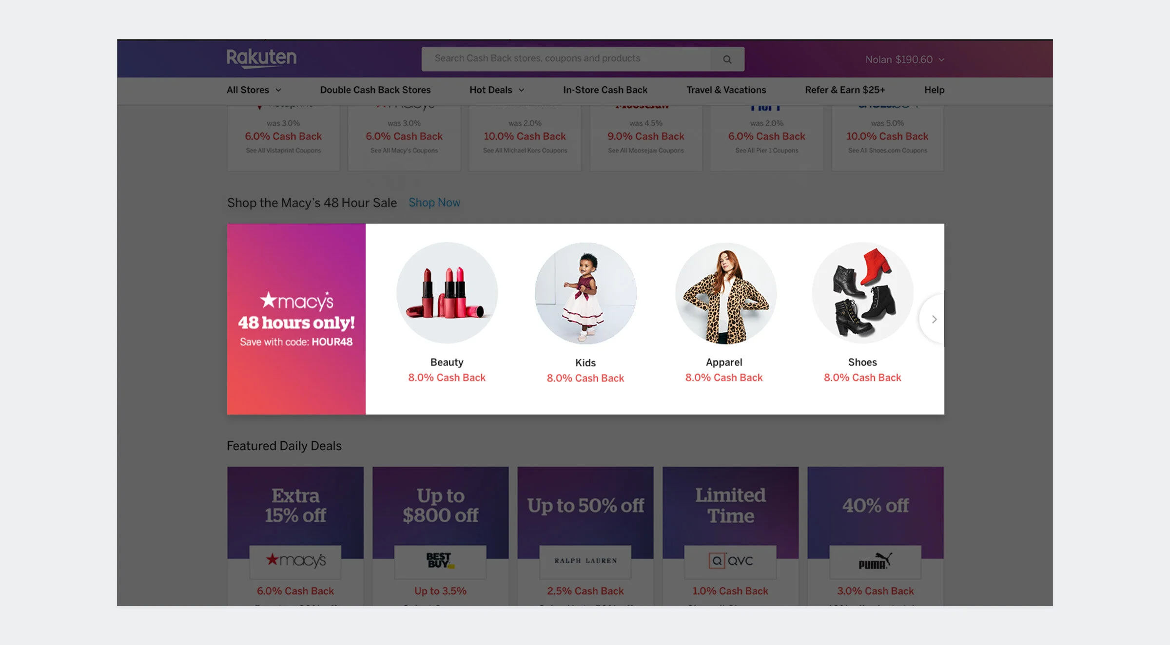
Curated Module
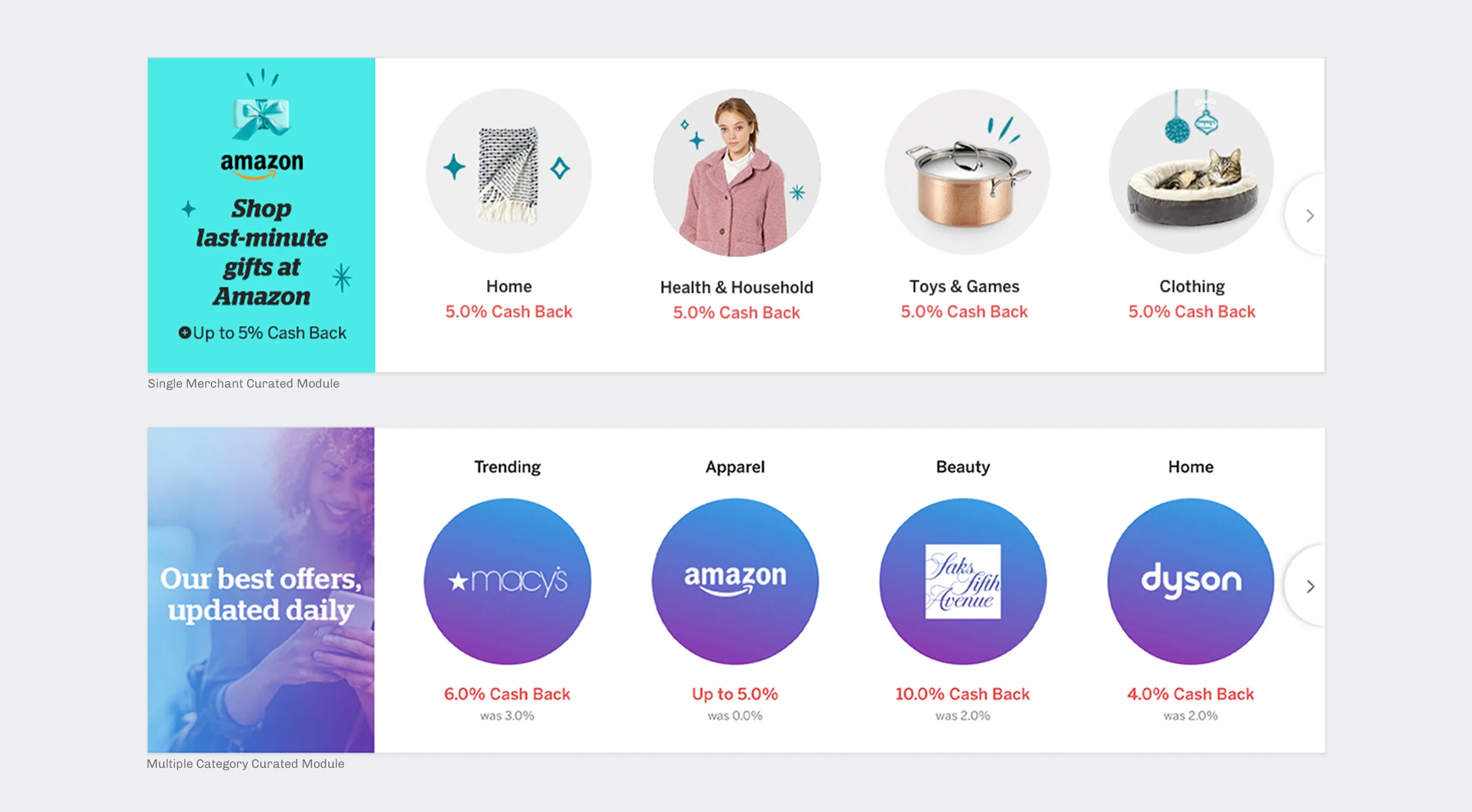
This placement promoted deals for different categories. The module would update daily based on customer data. Merchants partners also had the opportunity to buy into the entire module. This was especially useful for large retailers with multiple departments.
Right Rails
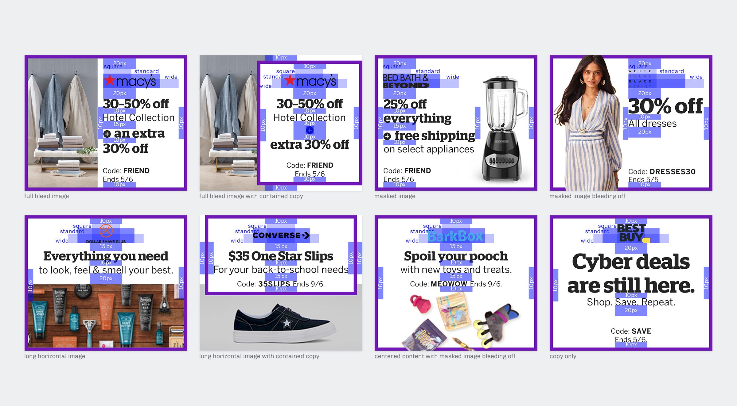
This placement gave merchant partners the opportunity to promote deals with imagery. The image-based placement helped to provide contrast next to a text-based module. Due to their small size of 300x250, I created a number of solutions to accommodate different types of imagery and copy lengths.
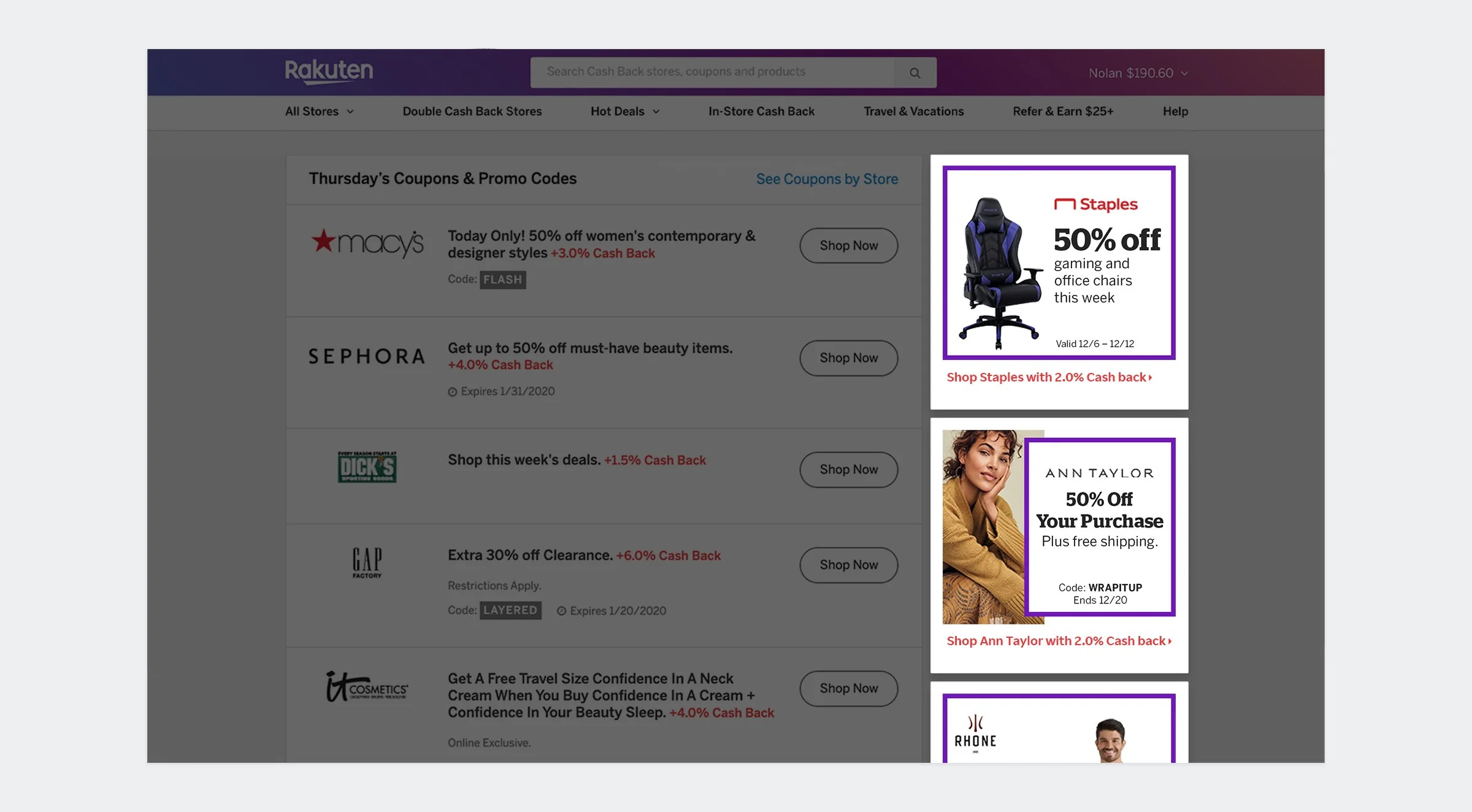
The template for this placement consisted of eight versions to accommodate varying text lengths and different types of imagery.
Sticky Footers
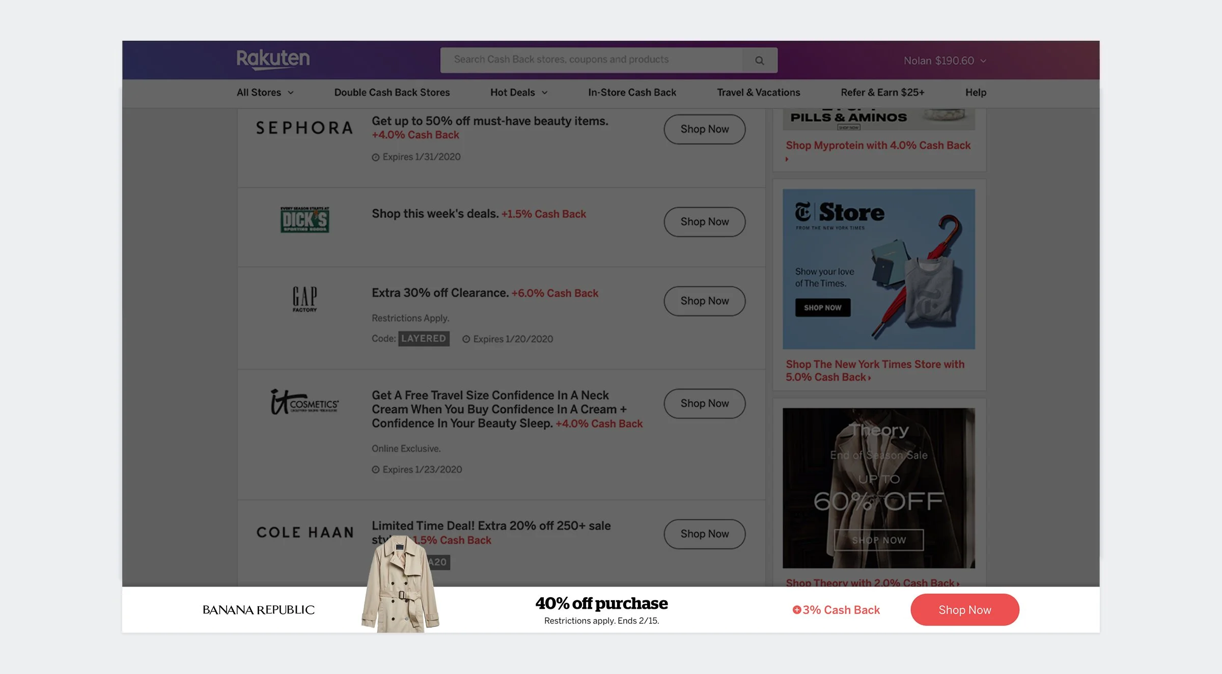
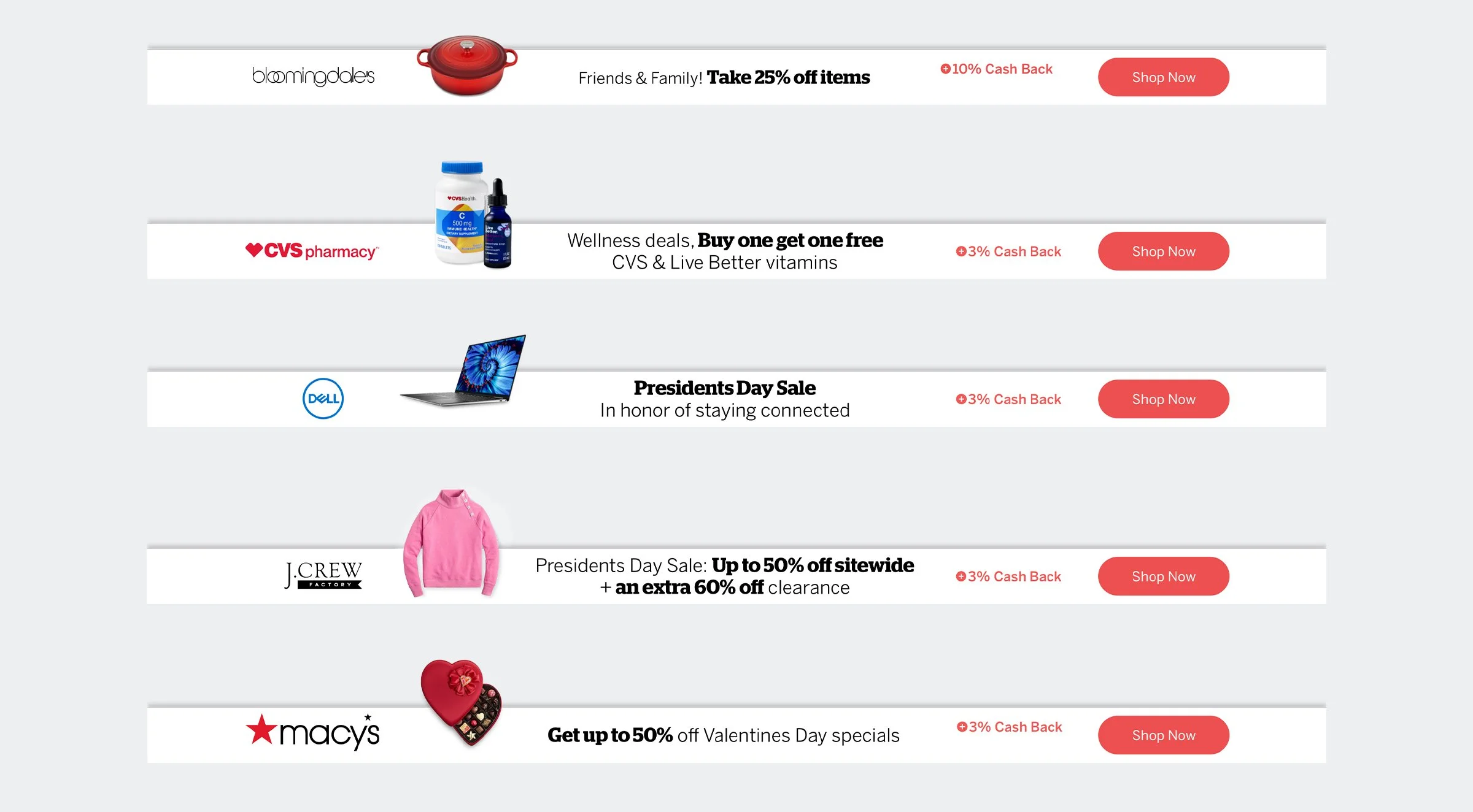
The Sticky Footer would promote a deal using a cropped product image overlapping the main content. The module would remain visible on the bottom of the homepage until manually closed out.
Guides and Templates
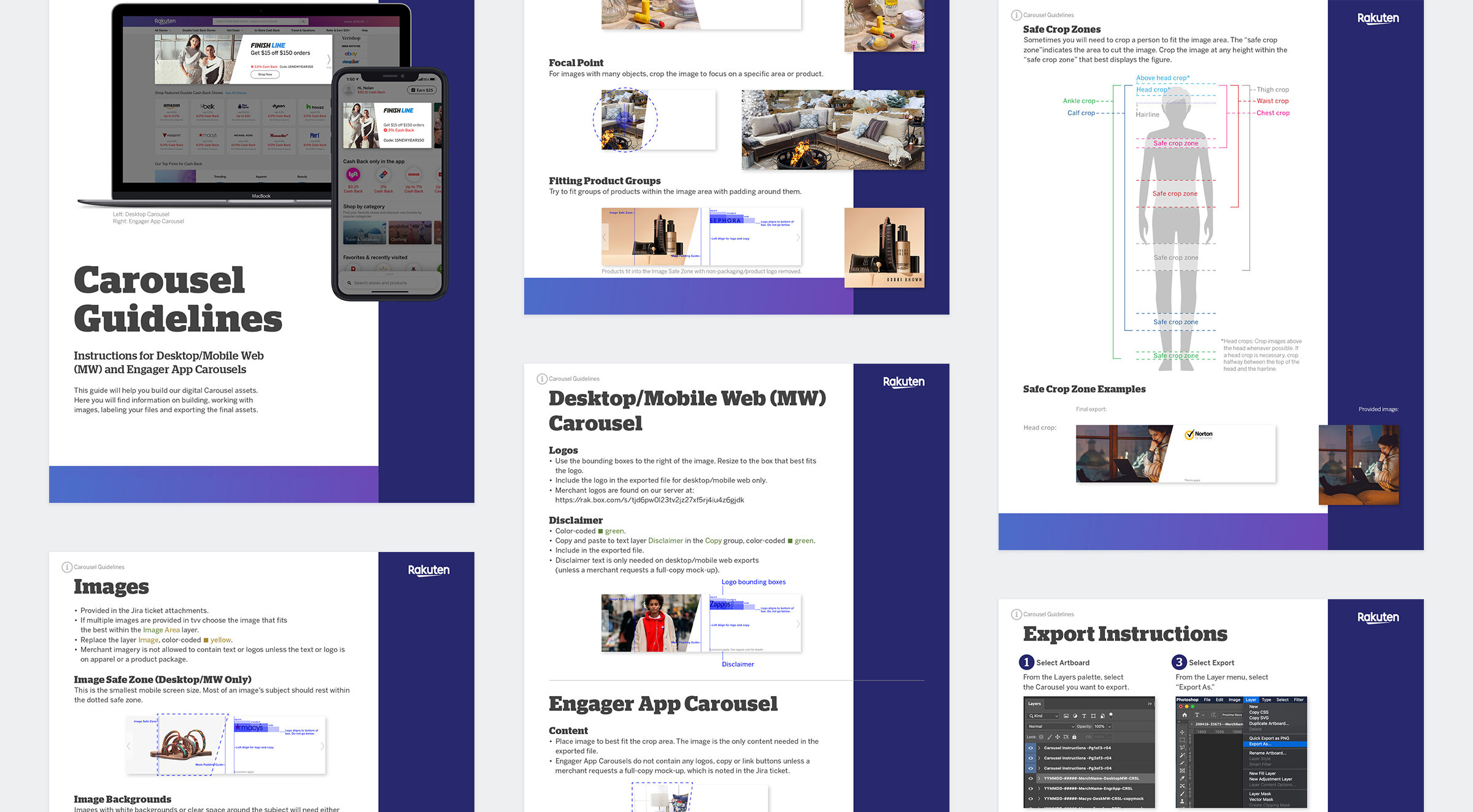
To ensure a cohesive look and feel amongst the various ad placements, a series of templates were created to assist the team in building on-spec ads quickly. In addition, I worked on guidelines to help agency partners who were contracted to build Rakuten ads as well.
Ad guidelines were developed to help external design partners optimize their imagery for various responsive sizes and placement requirements.